A company’s logo is the personification of your company, which is in many ways its corporate identity.
A brand logo can strengthen the reputation of a company at the market or ruin everything. Just consider the most iconic ones – for instance Apple or Nike: they have something ingenious, nevertheless simple.
Simple logo designs are sometimes ordinary-looking and boring. Lots of renowned companies all over the world have logos that are simple yet effective. Think back to the well-known FedEx.
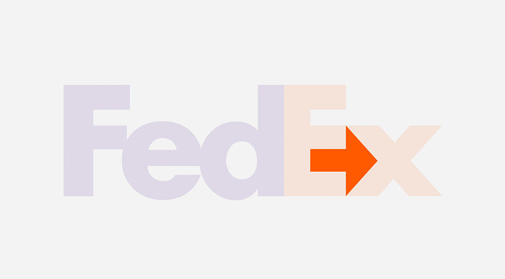
It looks charmless and unimaginative, many people may think. However, if you make a little effort, you will find an arrow between the last two letters, which represents the company’s prosperity and growth. Simple? Right. But smart.
Attracting the attention of the customer is half the battle, the real mastery is to make people remember it, make them think about it and start looking for associations.
It is categorically important to remember that the symbol of the company appears almost everywhere: souvenirs, business cards, decoration of work premises, documentation, advertising strategies. It is constantly in sight, so it is crucial to make sure that the emblem does not distract attention and does not irritate the eyes.
Thanks to modern technologies, you can see how your logo will look in reality using a free business card mockup.
Always keep in mind that marketing managers and creators are inventive people. They cannot always look at their product from a different point of view and notice significant shortcomings that can subsequently lead to the collapse of a company. Sometimes company leaders take notice of the designer’s product or do not have time to scrupulously contemplate it and put it into production.
Following the outrage that broke out in the USA concerning acts of assault among Catholic reverends and their superiors, state organizations commenced to examine everything regarding child abuse. However, they overlooked the city of Arlington, where the local Medical Center had this sign and hundreds of passersby could witness it firsthand every day.

There’s more to it. Check out the emblem of the Catholic Church Youth Committee. This sign was invented in 1973. It seemed so triumphant that it even received the award of the Art Directors Club in Los Angeles… According to the inventor, the image displays a child and a priest.

Perhaps the author of this sign had nothing bad in his mind, but the typical way of thinking generated what it had generated.
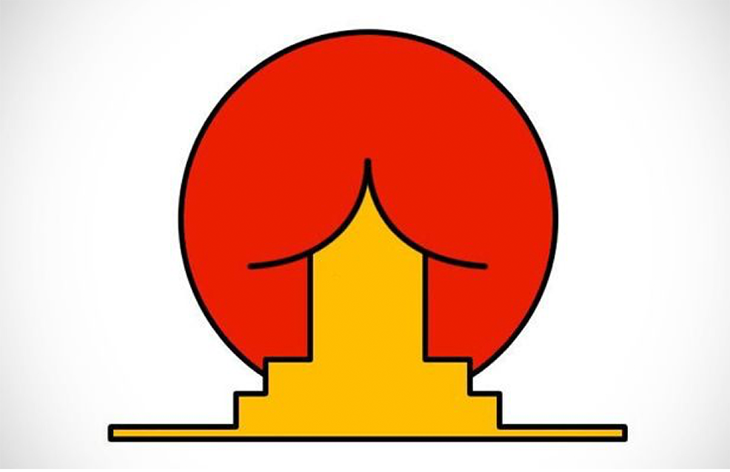
This was supposed to be the distinctive feature of the Institute of Oriental Studies. The concept was to picture a classical element of the construction of oriental culture, the roof, and a giant the morning sun. The outcome is astounding.
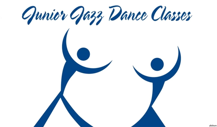
Could you believe that this logotype depicts a couple dancing jazz? I’m more than confident you don’t. I’m wondering how many amateurs they drew into dancing. Not many, I guess, but they had certainly got their attention.

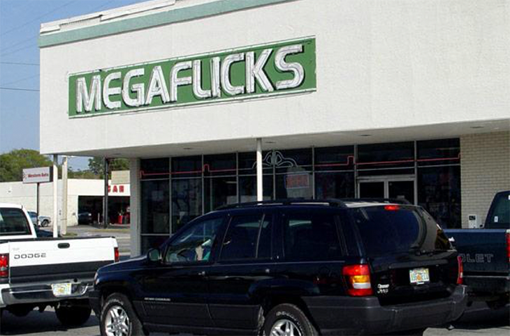
It’s hard to say exactly why the Florida-based Megaflicks went bankrupt, but the logo could be a good reason.
The massage therapist learned how spacing can do harm to the business when an unfortunate gap appeared between the E and the R in his logo, which completely changed the entire message.

Creating a logo is not an easy task: there are many nuances that need to be taken into account when designing it.
Vague messages, incorrect typography, and weird design combinations are just a few of the problems designers can face.
After viewing these awkward logos, absolutely everyone will understand why it is so important to always carefully check all materials (especially large signs) for such misunderstandings.
The above examples may look ridiculous and funny, but no company wants to have logos like these.